A Spry Validation Text Field widget is a text field that displays valid or invalid states when the site visitor enters text. For example, you can add a Validation Text Field widget to a form in which visitors type their e-mail addresses. If they fail to type the @ sign and a period (.) in the e-mail address, the widget returns a message stating that the information the user entered is invalid.
A version of this file is available on Adobe LiveDocs. Please check it for comments and updates.
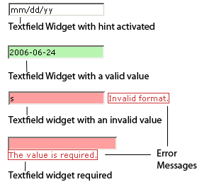
The following example shows a Validation Text Field widget in various states:
The Validation Text Field widget includes a number of states (for example, valid, invalid, required value, and so on). You can alter the properties of these states by editing the corresponding CSS file (SpryValidationTextField.css), depending on the desired validation results. A Validation Text Field widget can validate at various points—for example, when the site visitor clicks outside the widget, when they type, or when they try to submit the form.
The default HTML code for the Validation Text Field widget, usually inside a form, is made up of a container span tag that surrounds the input tag of the text field. The HTML code for the Validation Text Field widget also includes script tags in the head of the document and after the widget’s HTML code. The script tag in the head of the document defines all of the JavaScript functions related to the Text Field widget. The script tag after the widget code creates a JavaScript object that makes the text field interactive.
Following is the HTML code for a Validation Text Field widget:
<head>
...
<!-- Link the Spry Validation Text Field JavaScript library -->
<script src="SpryAssets/SpryValidationTextField.js" type="text/javascript"></script>
<!-- Link the CSS style sheet that styles the widget -->
<link href="SpryAssets/SpryValidationTextField.css" rel="stylesheet" type="text/css" />
</head>
<body>
	<form id="form1" name="form1" method="post" action="">
		<!-- Create the text field widget and assign a unique id-->
		<span id="sprytextfield1">
			<input type="text" name="mytextfield" id="mytextfield" />
			<!--Display an error message>
			<span class="textfieldRequiredMsg">A value is required.</span>
		</span>
	</form>
<!-- Initialize the Validation Text Field widget object-->
<script type="text/javascript">
var sprytextfield1 = new Spry.Widget.ValidationTextField("sprytextfield1");
</script>
</body>
In the code, the new JavaScript operator initializes the Text Field widget object, and transforms the span content with the ID of sprytextfield1 from static HTML code into an interactive page element.
The span tag for the error message in the widget has a CSS class applied to it. This class (which is set to display:none; by default), controls the style and visibility of the error message, and exists in the accompanying CSS file SpryValidationTextField.css. When the widget enters different states as a result of user interaction, Spry places different classes on the container for the widget, which in turn affects the error-message class.
To add other error messages to a Validation Text Field widget, create a span tag (or any other type of tag) to hold the text of the error message. Then, by applying a CSS class to it, you can hide or show the message, depending on the widget state.
You can add other error messages to a Validation Text Field widget by creating the corresponding CSS rule in the SpryValidationTextField.css file. For example, to change the background color for a state, edit the corresponding rule or add a new rule (if it’s not already present) in the style sheet.
In the preceding example, we used span tags to create the structure for the widget:
Container SPAN
	INPUT type="text"
	Error message SPAN
You can, however, use almost any container tag to create the widget:
Container DIV
	INPUT type="text"
	Error Message P
Spry uses the tag ID (not the tag itself) to create the widget. Spry also displays error messages using CSS code that is indifferent to the actual tag used to contain the error message.
The ID passed into the widget constructor identifies a specific HTML element. The constructor finds this element and searches the identified container for a corresponding input tag. If the ID passed to the constructor is the ID of the input tag (rather than a container tag), the constructor attaches validation triggers directly to the input tag. If no container tag is present, however, the widget cannot display error messages, and different validation states alter only the appearance of the input tag element (for example, its background color).
Note: Multiple INPUT tags do not work inside the same HTML widget container. Each text field should be its own widget.
The SpryValidationTextField.css file contains the rules that style the Validation Text Field widget and its error messages. You can edit these rules to style the look and feel of the widget and error messages. The names of the rules in the CSS file correspond to the names of the classes specified in the widget’s HTML code.
The following is the CSS code for the SpryValidationTextField.css file:
/*Text Field styling classes*/
.textfieldRequiredMsg,
.textfieldInvalidFormatMsg,
.textfieldMinValueMsg,
.textfieldMaxValueMsg,
.textfieldMinCharsMsg,
.textfieldMaxCharsMsg,
.textfieldValidMsg {
	display: none;
}
.textfieldRequiredState .textfieldRequiredMsg,
.textfieldInvalidFormatState .textfieldInvalidFormatMsg,
.textfieldMinValueState .textfieldMinValueMsg,
.textfieldMaxValueState .textfieldMaxValueMsg,
.textfieldMinCharsState .textfieldMinCharsMsg,
.textfieldMaxCharsState .textfieldMaxCharsMsg {
	display: inline;
	color: #CC3333;
	border: 1px solid #CC3333;
}
.textfieldValidState input, input.textfieldValidState {
	background-color: #B8F5B1;
}
input.textfieldRequiredState, .textfieldRequiredState input,
input.textfieldInvalidFormatState, .textfieldInvalidFormatState input,
input.textfieldMinValueState, .textfieldMinValueState input,
input.textfieldMaxValueState, .textfieldMaxValueState input,
input.textfieldMinCharsState, .textfieldMinCharsState input,
input.textfieldMaxCharsState, .textfieldMaxCharsState input {
	background-color: #FF9F9F;
}
.textfieldFocusState input, input.textfieldFocusState {
	background-color: #FFFFCC;
}
.textfieldFlashText input, input.textfieldFlashText {
	color: red !important;
}
.textfieldHintState input, input.textfieldHintState {
}
The SpryValidationTextField.css file also contains extensive comments, explaining the code and the purpose for certain rules. For further information, see the comments in the file.
For example, create a folder called SpryAssets in the root folder of your web site, and move the SpryValidationTextField.js file to it. The SpryValidationTextField.js file contains all of the information necessary for making the Text Field widget interactive.
<script src="SpryAssets/SpryValidationTextField.js" type="text/javascript"></script>
Make sure that the file path to the SpryValidationTextField.js file is correct. This path varies depending on where you’ve placed the file in your web site.
<link href="SpryAssets/SpryValidationTextField.css" rel="stylesheet" type="text/css" />
Make sure that the file path to the SpryValidationTextField.css file is correct. This path varies depending on where you’ve placed the file in your web site.
<input type="text" name="mytextfield" id="mytextfield"/>
<span id="sprytextfield1">
	<input type="text" name="mytextfield" id="mytextfield"/>
</span>
<script type="text/javascript">
	var sprytextfield1 = new Spry.Widget.ValidationTextField("sprytextfield1");
</script>
The new JavaScript operator initializes the Text Field widget object, and transforms the span tag content with the ID of sprytextfield1 from static HTML code into an interactive text field object. The Spry.Widget.ValidationTextField method is a constructor in the Spry framework that creates text field objects. The information necessary to initialize the object is contained in the SpryValidationTextField.js JavaScript library that you linked to at the beginning of this procedure.
Make sure that the ID of the text field’s container span tag matches the ID parameter you specified in the Spry.Widgets.ValidationTextField method. Make sure that the JavaScript call comes after the HTML code for the widget.
The complete code looks as follows:
<head>
...
<script src="SpryAssets/SpryValidationTextField.js" type="text/javascript"></script>
<link href="SpryAssets/SpryValidationTextField.css" rel="stylesheet" type="text/css" />
</head>
<body>
	<span id="sprytextfield1">
		<input type="text" name="mytextfield" id="mytextfield" />
	</span>
<script type="text/javascript">
	var sprytextfield1 = new Spry.Widget.ValidationTextField("sprytextfield1");
</script>
</body>
Create a span tag (or any other type of tag) to display the error message, and assign the appropriate class to it, as follows:
<span id="sprytextfield1">
	<input type="text" name="mytextfield" id="mytextfield" />
	<span class="textfieldRequiredMsg">Please enter a description</span>
</span>
The textfieldRequiredMsg rule is located in the SpryValidationTextField.css file, and is set to display:none by default. When the widget enters a different state through user interaction, Spry applies the appropriate class—the state class—to the container of the widget. This action affects the error message class, and by extension, the appearance of the error message.
For example, the following shows a portion of the CSS rule from the SpryValidationTextField.css file:
.textfieldRequiredMsg,
.textfieldInvalidFormatMsg,
.textfieldMinValueMsg,
.textfieldMaxValueMsg,
.textfieldMinCharsMsg,
.textfieldMaxCharsMsg,
.textfieldValidMsg {
	display: none;
}
.textfieldRequiredState .textfieldRequiredMsg,
.textfieldInvalidFormatState .textfieldInvalidFormatMsg,
.textfieldMinValueState .textfieldMinValueMsg,
.textfieldMaxValueState .textfieldMaxValueMsg,
.textfieldMinCharsState .textfieldMinCharsMsg,
.textfieldMaxCharsState .textfieldMaxCharsMsg{
	display: inline;
	color: #CC3333;
	border: 1px solid #CC3333;
}
By default, no state class is applied to the widget container, so that when the page loads in a browser, the error message text in the preceding HTML code example only has the textfieldRequiredMsg class applied to it. (The property and value pair for this rule is display:none, so the message remains hidden.) If the user fails to enter text in a required text field, however, Spry applies the appropriate class to the widget container, as follows:
<span id="sprytextfield1" class="textfieldRequiredState">
	<input type="text" name="mytextfield" id="mytextfield" />
	<span class="textfieldRequiredMsg">Please enter a description</span>
</span>
In the preceding CSS code, the state rule with the contextual selector .textfieldRequiredState .textfieldRequiredMsg overrides the default error-message rule responsible for hiding the error-message text. Thus, when Spry applies the state class to the widget container, the state rule determines the appearance of the widget, and displays the error message inline in red with a 1-pixel solid border.
Following is a list of default error-message classes and their descriptions. You can change these classes and rename them. If you do so, don’t forget to change them in the contextual selector also.
| Error message class |
Description |
|---|---|
.textfieldRequiredMsg |
Causes error message to display when the widget enters the required state |
.textfieldInvalidFormatMsg |
Causes error message to display when the widget enters the invalid state |
.textfieldMinValueMsg |
Causes error message to display when the widget enters the minimum value state |
.textfieldMaxValueMsg |
Causes error message to display when the widget enters the maximum value state |
.textfieldMinCharsMsg |
Causes error message to display when the widget enters the minimum number of characters state |
.textfieldMaxCharsMsg |
Causes error message to display when the widget enters the maximum number of characters state |
.textfieldValidMsg |
Causes error message to display when the widget enters the valid state |
Note: You cannot rename state-related class names because they are hard-coded as part of the Spry framework.
You can specify many different validation types, formats, and other options for the Validation Text Field widget. For example, you can specify a credit card validation type if the text field will receive credit card numbers.
You specify validation types, formats, and other options as parameters in the widget constructor. The first parameter in the constructor is the widget container ID, followed by a second parameter (the validation-type parameter), and optionally, a third parameter. The third parameter is a JavaScript array of options that depends on the validation type set in the second parameter. Thus, you cannot set the third parameter without setting the second.
Note: In cases where you want to set the third parameter, but no validation type is required, you can set the validation type to "none".
The following code shows the generic syntax for a Text Field widget constructor with various parameters:
<script type="text/javascript">
	var sprytextfield1= new Spry.Widget.ValidationTextField("WidgetContainerID", "ValidationType", {option1:"value1", option2:"value2", ..});
</script>
Most validation types cause the text field to expect a standard format. For example, if you apply the integer validation type to a text field, the widget won’t validate unless the user enters numbers in the text field. Some validation types, however, let you choose the kind of format your text field will accept.
The following table lists the available validation types and their formats.
| Validation type |
Format |
|---|---|
none |
No particular format required. |
integer |
Text field accepts numbers only. |
Text field accepts e-mail addresses that contain the @ sign and a period (.) that is both preceded and followed by at least one letter. |
|
date |
Formats vary. |
time |
Formats vary. |
credit_card |
Formats vary. |
zip_code |
Formats vary. |
phone_number |
Text field accepts phone numbers formatted for U.S. and Canada (000) 000-0000 as well as custom formats. |
social_security_number |
Text field accepts social security numbers formatted as 000-00-0000 by default. |
currency |
Text field accepts currency formatted as 1,000,000.00 or 1.000.000,00. |
real |
Validates various kinds of numbers and scientific notation: integers (for example, 1); float values (for example, 12.123); and float values in scientific notation (for example, 1.212e+12, 1.221e-12 where e is used as a power of 10). |
ip |
Validates IPv4, IPv6, or both kinds of IP addresses. |
url |
Text field accepts URLs formatted as http://xxx.xxx.xxx, https://xxx.xxx.xxx, or ftp://xxx.xxx.xxx. |
custom |
Lets you specify a custom validation type and format. |
To set the text field to accept only integer values, add "integer" as the value for the second parameter in the constructor, as follows:
<script type="text/javascript">
	var textfieldwidget1 = new Spry.Widget.ValidationTextField("textfieldwidget1", "integer");
</script>
The integer validation type accepts both negative and positive values. To accept only positive values, add the allowNegative option to the third parameter, and set the value to false.
<script type="text/javascript">
	var textfieldwidget1 = new Spry.Widget.ValidationTextField("textfieldwidget1", "integer", {allowNegative:false});
</script>
The following table shows other common options and values for the third parameter.
| Option |
Value |
|---|---|
format |
Not applicable |
validateOn |
["blur"]; ["change"]; or both together (["blur", "change"]) |
isRequired |
true (the default); false |
useCharacterMasking |
false (the default); true |
minChars/maxChars |
Not applicable |
minValue/maxValue |
Integer value |
pattern |
Not applicable |
To set the text field to accept only standard e-mail formats, add "email" as the value for the second parameter in the constructor, as follows:
<script type="text/javascript">
	var sprytextfield1= new Spry.Widget.ValidationTextField("sprytextfield1", "email");
</script>
You can also set options for the third parameter by using the following syntax:
<script type="text/javascript">
	var textfieldwidget1 = new Spry.Widget.ValidationTextField("textfieldwidget1", "email", {option:value});
</script>
The following table shows some common options and values for the third parameter.
| Option |
Value |
|---|---|
format |
Not applicable |
validateOn |
["blur"]; ["change"]; or both together (["blur", "change"]) |
isRequired |
true (the default); false |
useCharacterMasking |
Not applicable |
minChars/maxChars |
Positive integer value |
minValue/maxValue |
Not applicable |
pattern |
Not applicable |
To set the text field to accept a date format, add "date" as the value for the second parameter in the constructor, as follows:
<script type="text/javascript">
	var sprytextfield1= new Spry.Widget.ValidationTextField("sprytextfield1", "date");
</script>
The default date format is "mm/dd/yy" (U.S. date format). You can, however, set a number of other date formats in the third parameter by using the format option, as in the following example:
<script type="text/javascript">
	var textfieldwidget1 = new Spry.Widget.ValidationTextField("textfieldwidget1", "date", {format:"yyyy-mm-dd"});
</script>
The following table shows a full list of formatting options, as well as some other common options and values, for the third parameter.
| Option |
Value |
|---|---|
format |
"mm/dd/yy" (default); "mm/dd/yyyy"; "dd/mm/yyyy"; "dd/mm/yy"; "yy/mm/dd"; "yyyy/mm/dd"; "mm-dd-yy"; "dd-mm-yy"; "yyyy-mm-dd"; "mm.dd.yyyy"; "dd.mm.yyyy"; |
validateOn |
["blur"]; ["change"]; or both together (["blur", "change"]) |
isRequired |
true (the default); false |
useCharacterMasking |
false (the default); true |
minChars/maxChars |
Not applicable |
minValue/maxValue |
Date value in the specified format |
pattern |
Not applicable |
To set the text field to accept a time format, add "time" as the value for the second parameter in the constructor, as follows:
<script type="text/javascript">
	var sprytextfield1= new Spry.Widget.ValidationTextField("sprytextfield1", "time");
</script>
The default date format is "HH:mm" (hours and minutes). You can, however, set a number of other time formats in the third parameter by using the format option, as in the following example:
<script type="text/javascript">
	var textfieldwidget1 = new Spry.Widget.ValidationTextField("textfieldwidget1", "time", {format:"HH:mm:ss"});
</script>
The following table shows a full list of formatting options, as well as some other common options and values, for the third parameter.
| Option |
Value |
|---|---|
format |
"HH:mm" (the default); "HH:mm:ss"; "hh:mm tt"; "hh:mm:ss tt"; "hh:mm t"; "hh:mm;ss t"; (where "tt" stands for am/pm format, and "t" stands for a/p format.) |
validateOn |
["blur"]; ["change"]; or both together (["blur", "change"]) |
isRequired |
true (the default); false |
useCharacterMasking |
false (the default); true |
minChars/maxChars |
Not applicable |
minValue/maxValue |
Time value in the specified format |
pattern |
Not applicable |
To set the text field to accept a credit card format, add "credit_card" as the value for the second parameter in the constructor, as follows:
<script type="text/javascript">
	var sprytextfield1= new Spry.Widget.ValidationTextField("sprytextfield1", "credit_card");
</script>
The default is to validate all types of credit cards, but you can specify particular credit card formats to accept in the third parameter by using the format option, as in the following example:
<script type="text/javascript">
	var textfieldwidget1 = new Spry.Widget.ValidationTextField("textfieldwidget1", "credit_card", {format:"visa"});
</script>
The following table shows a full list of formatting options, as well as some other common options and values, for the third parameter.
| Option |
Value |
|---|---|
format |
No format (the default); "visa"; "mastercard"; "amex"; "discover"; "dinersclub" |
validateOn |
["blur"]; ["change"]; or both together (["blur", "change"]) |
isRequired |
true (the default); false |
useCharacterMasking |
false (the default); true |
minChars/maxChars |
Not applicable |
minValue/maxValue |
Not applicable |
pattern |
Not applicable |
To set the text field to accept a zip code format, add "zip_code" as the value for the second parameter in the constructor, as follows:
<script type="text/javascript">
	var sprytextfield1= new Spry.Widget.ValidationTextField("sprytextfield1", "zip_code");
</script>
The default format is the U.S. 5-digit zip code format, but you can specify a number of other formats in the third parameter by using the format option, as in the following example:
<script type="text/javascript">
	var textfieldwidget1 = new Spry.Widget.ValidationTextField("textfieldwidget1", "zip_code", {format:"zip_uk"});
</script>
The following table shows a full list of formatting options, as well as some other common options and values, for the third parameter.
| Option |
Value |
|---|---|
format |
"zip_us5" (the default); "zip_us9"; "zip_uk"; "zip_canada"; "zip_custom" |
validateOn |
["blur"]; ["change"]; or both together (["blur", "change"]) |
isRequired |
true (the default); false |
useCharacterMasking |
false (the default); true |
minChars/maxChars |
Not applicable |
minValue/maxValue |
Not applicable |
pattern |
Custom zip code pattern. Used when format="zip_custom" |
The "zip_custom" format lets you specify your own customized pattern for zip-code format. After specifying "zip_custom" as your format, add the pattern option to the third parameter to define the format. For example, you might want to validate a zip code that has three numbers, followed by another set of numbers and case-sensitive alphabetic characters. After the format option, add the pattern option in the third parameter of the constructor to specify the custom pattern, as follows:
<script type="text/javascript">
	var textfieldwidget1 = new Spry.Widget.ValidationTextField("textfieldwidget1", "zip_code", {format:"zip_custom", pattern:"000 00AA"});
</script>
The following table shows a full list of values used for custom patterns.
| Value |
Description |
|---|---|
"0" |
Whole numbers between 0 and 9 |
"A" |
Uppercase alphabetic characters |
"a" |
Lowercase alphabetic characters |
"B"; "b" |
Case-insensitive alphabetic characters |
"X" |
Uppercase alphanumeric characters |
"x" |
Lowercase alphanumeric characters |
"Y"; "y" |
Case-insensitive alphanumeric characters |
"?" |
Any character |
The "A", "a", "X", and "x" custom pattern characters are case sensitive. In situations that use these characters, Spry converts the characters to the correct case, even if the user enters the wrong case.
To set the text field to accept a phone number format, add "phone_number" as the value for the second parameter in the constructor, as follows:
<script type="text/javascript">
	var sprytextfield1= new Spry.Widget.ValidationTextField("sprytextfield1", "phone_number");
</script>
The default format is U.S. area code and phone number format: (000) 000-0000, but you can specify a custom format in the third parameter by using the "phone_custom" and "pattern" options, as in the following example:
<script type="text/javascript">
	var textfieldwidget1 = new Spry.Widget.ValidationTextField("textfieldwidget1", "zip_code", {format:"phone_custom" , pattern:"00 0000 A"});
</script>
The following table shows a full list of values used for custom patterns.
| Value |
Description |
|---|---|
"0" |
Whole numbers between 0 and 9 |
"A" |
Uppercase alphabetic characters |
"a" |
Lowercase alphabetic characters |
"B"; "b" |
Case-insensitive alphabetic characters |
"X" |
Uppercase alphanumeric characters |
"x" |
Lowercase alphanumeric characters |
"Y"; "y" |
Case-insensitive alphanumeric characters |
"?" |
Any character |
The "A", "a", "X", and "x" custom pattern characters are case sensitive. In situations that use these characters, Spry converts the characters to the correct case, even if the user enters the wrong case.
The following table shows some other common options and values for the third parameter.
| Option |
Value |
|---|---|
format |
"phone_number" (the default); "phone_custom" |
validateOn |
["blur"]; ["change"]; or both together (["blur", "change"]) |
isRequired |
true (the default); false |
useCharacterMasking |
false (the default); true |
minChars/maxChars |
Not applicable |
minValue/maxValue |
Not applicable |
pattern |
Custom phone pattern. Used when format="phone_custom" |
To set the text field to accept a social security number format, add "social_security_number" as the value for the second parameter in the constructor, as follows:
<script type="text/javascript">
	var sprytextfield1= new Spry.Widget.ValidationTextField("sprytextfield1", "social_security number");
</script>
The default format is U.S. social security number format with dashes: 000-00-0000, but you can specify a custom format in the third parameter by using the pattern option, as in the following example:
<script type="text/javascript">
	var textfieldwidget1 = new Spry.Widget.ValidationTextField("textfieldwidget1", "social_security_number", {format:"custom" pattern:"00 0000 A"});
</script>
The following table shows a full list of values used for custom patterns.
| Value |
Description |
|---|---|
"0" |
Whole numbers between 0 and 9 |
"A" |
Uppercase alphabetic characters |
"a" |
Lowercase alphabetic characters |
"B"; "b" |
Case-insensitive alphabetic characters |
"X" |
Uppercase alphanumeric characters |
"x" |
Lowercase alphanumeric characters |
"Y"; "y" |
Case-insensitive alphanumeric characters |
"?" |
Any character |
The "A", "a", "X", and "x" custom pattern characters are case sensitive. In situations that use these characters, Spry converts the characters to the correct case, even if the user enters the wrong case.
The following table shows some other common options for the third parameter.
| Option |
Value |
|---|---|
format |
Not applicable |
validateOn |
["blur"]; ["change"]; or both together (["blur", "change"]) |
isRequired |
true (the default); false |
useCharacterMasking |
false (the default); true |
minChars/maxChars |
Not applicable |
minValue/maxValue |
Not applicable |
pattern |
Custom social security pattern |
To set the text field to accept a currency number format, add "currency" as the value for the second parameter in the constructor, as follows:
<script type="text/javascript">
	var sprytextfield1= new Spry.Widget.ValidationTextField("sprytextfield1", "currency");
</script>
The default format is U.S. currency format: 1,000.00, but you can also specify the "dot_comma" format (1.000,00) in the third parameter, as follows:
<script type="text/javascript">
	var textfieldwidget1 = new Spry.Widget.ValidationTextField("textfieldwidget1", "currency", {format:"dot_comma"});
</script>
In both cases, the separators for the 3-digit groups can be optional and the decimal part (i.e. the .00 in 1,000.00) is not required.
The following table shows some other common options for the third parameter.
| Option |
Value |
|---|---|
format |
"comma_dot" (the default); "dot_comma" |
validateOn |
["blur"]; ["change"]; or both together (["blur", "change"]) |
isRequired |
true (the default); false |
useCharacterMasking |
false (the default); true |
minChars/maxChars |
Not applicable |
minValue/maxValue |
Numeric value with two decimal numbers allowed |
pattern |
Not applicable |
To set the text field to accept real numbers and scientific notation, add "real" as the value for the second parameter in the constructor, as follows:
<script type="text/javascript">
	var sprytextfield1= new Spry.Widget.ValidationTextField("sprytextfield1", "real");
</script>
The text field validates a real number in scientific notation, for example 1.231e10.
The following table shows some other common options for the third parameter.
| Option |
Value |
|---|---|
format |
Not applicable |
validateOn |
["blur"]; ["change"]; or both together (["blur", "change"]) |
isRequired |
true (the default); false |
useCharacterMasking |
false (the default); true |
minChars/maxChars |
Not applicable |
minValue/maxValue |
Numeric value with decimal numbers |
pattern |
Not applicable |
To set the text field to validate an IP address, add "ip" as the value for the second parameter in the constructor, as follows:
<script type="text/javascript">
	var sprytextfield1= new Spry.Widget.ValidationTextField("sprytextfield1", "ip");
</script>
The default accepted IP address format is IPv4, but you can set other IP address formats in the third parameter by using the format option, as in the following example:
<script type="text/javascript">
	var textfieldwidget1 = new Spry.Widget.ValidationTextField("textfieldwidget1", "ip", {format:"ipv6"});
</script>
The following table shows the formatting options, as well as some other common options, for the third parameter.
| Option |
Value |
|---|---|
format |
"ipv4" (the default); "ipv6"; "ipv4_ipv6" |
validateOn |
["blur"]; ["change"]; or both together (["blur", "change"]) |
isRequired |
true (the default); false |
useCharacterMasking |
false (the default); true |
minChars/maxChars |
Not applicable |
minValue/maxValue |
Not applicable |
pattern |
Not applicable |
To set the text field to accept only URL values, add "url" as the value for the second parameter in the constructor, as follows:
<script type="text/javascript">
	var textfieldwidget1 = new Spry.Widget.ValidationTextField("textfieldwidget1", "url");
</script>
The URL validation type accepts HTTP, HTTPS, and FTP URL values.
The following table shows other common options for the third parameter.
| Option |
Value |
|---|---|
format |
Not applicable |
validateOn |
["blur"]; ["change"]; or both together (["blur", "change"]) |
isRequired |
true (the default); false |
useCharacterMasking |
Not applicable |
minChars/maxChars |
Positive integer value |
minValue/maxValue |
Not applicable |
pattern |
Not applicable |
To set the text field to accept any kind of customized format, specify "custom" as the value for the second parameter, and adding the pattern option in the third parameter, as follows:
<script type="text/javascript">
	var textfieldwidget1 = new Spry.Widget.ValidationTextField("textfieldwidget1", "custom", {pattern:"00 0000 AX"});
</script>
The following table shows a full list of values used for custom patterns.
| Value |
Description |
|---|---|
"0" |
Whole numbers between 0 and 9 |
"A" |
Uppercase alphabetic characters |
"a" |
Lowercase alphabetic characters |
"B"; "b" |
Case-insensitive alphabetic characters |
"X" |
Uppercase alpha-numeric characters |
"x" |
Lowercase alpha-numeric characters |
"Y"; "y" |
Case-insensitive alpha-numeric characters |
"?" |
Any character |
The "A", "a", "X", and "x" custom pattern characters are case sensitive. In situations that use these characters, Spry converts the characters to the correct case, even if the user enters the wrong case.
By default, the Validation Text Field widget validates when the user clicks the submit button. You can, however, set two other options: blur or change. The validateOn:["blur"] parameter causes the widget to validate whenever the user clicks outside the text field. The validateOn:["change"] parameter causes the widget to validate as the user changes text inside the text field.
To specify when validation occurs, add a validateOn parameter to the constructor as follows:
<script type="text/javascript">
	var sprytextfield1 = new Spry.Widget.ValidationTextField("sprytextfield1", "none", {validateOn:["blur"]});
</script>
As a convenience, you can discard the brackets if your validateOn parameter contains a single value (for example, validateOn: "blur"). If the parameter contains both values, however (validateOn:["blur", "change"]), include brackets in the syntax.
Note: In the preceding example, the second parameter is set to "none", but it could easily be set to any of the available validation types (for example, "phone" or "credit_card"). See Specify a validation type and format.
This option is only available for the "none", "integer", "email", and "url" validation types.
The minChars option does not enforce a minimum number of characters if the text field is not required.
To specify a minimum or maximum number of characters, add the minChars property or maxChars property (or both) and a value to the constructor, as follows:
<script type="text/javascript">
	var textfieldwidget1 = new Spry.Widget.ValidationTextField("textfieldwidget1", "validation_type", {minChars:value, maxChars:value});
</script>
Note: If a validation type is not required, you can set the validation type to "none".
This option is only available for the "integer", "date", "time", "currency", and "real" validation types.
To specify minimum or maximum values in the text field, add the minValue property or maxValue property (or both) and a value to the constructor, as follows:
<script type="text/javascript">
	var textfieldwidget1 = new Spry.Widget.ValidationTextField("textfieldwidget1", "validation_type", {minValue:value, maxValue:value});
</script>
By default, Validation Text Field widgets require user input when published on a web page. You can, however, make the completion of text fields optional for the user.
To change the required status of a text field, add the isRequired property to the constructor and set its value to false, as follows:
<script type="text/javascript">
	var textfieldwidget1 = new Spry.Widget.ValidationTextField("textfieldwidget1", "none", {isRequired:false});
</script>
Note: In the preceding example, the second parameter is set to "none", but it could easily be set to any of the available validation types (for example, "phone" or "credit_card").
Because there are so many different kinds of formats for text fields, it is helpful to give your users a hint as to what format they need to enter. For example, a text field set with the Phone Number validation type accepts phone numbers in the form (000) 000-0000 by default. You can enter these sample numbers as a hint so that the text field displays the correct format when the user loads the page in a browser.
This option doesn't depend on the validation type, so you can always specify it. (Specify "none" as your validation type, if no other validation type is required.) When the user clicks inside the text field, the hint disappears; when the user clicks outside the text field, Spry restores the hint to the textfield if the field contains no value.
You can change the look of the hint text to be different than any other text field value through the CSS class "textfieldHintState".
To create a hint for a text field, add the hint property to the third parameter of the constructor and the text of your hint as the value, as follows:
<script type="text/javascript">
	var textfieldwidget1 = new Spry.Widget.ValidationTextField("textfieldwidget1", "validation_type", {hint:"some hint text here"});
</script>
You can prevent users from entering invalid characters in a Validation Text Field widget. For example, if you set this option for a widget set with the Integer validation type, nothing appears in the text field if the user tries to type a letter.
You must specify a validation type for this option because the specification of the third parameter depends on the second parameter. If no validation type is required, specify "none" as your validation type.
This option does not work in older browsers.
To block invalid characters, add the useCharacterMasking property to the constructor and set its value to true, as follows:
<script type="text/javascript">
	var textfieldwidget1 = new Spry.Widget.ValidationTextField("textfieldwidget1", "validation_type", {useCharacterMasking:true});
</script>
The SpryValidationTextField.css file provides the default styling for the Validation Text Field widget. You can, however, customize the widget by changing the appropriate CSS rule. The CSS rules in the SpryValidationTextField.css file use the same class names as the related elements in the widget’s HTML code, so it’s easy for you to know which CSS rules correspond to the widget and its error states.
The SpryValidationTextField.css file should already be included in your website before you start customizing.
The SpryValidationTextField.css file contains extensive comments, explaining the code and the purpose for certain rules. For further information, see the comments in the file.
By default, error messages for the Validation Text Field widget appear in red with a 1-pixel solid border surrounding the text.
To change the text styling of Validation Text Field widget error messages, use the following table to locate the appropriate CSS rule, and then change the default properties, or add your own text-styling properties and values.
| Text to change |
Relevant CSS rule |
Relevant properties to change |
|---|---|---|
Error message text |
.textfieldRequiredState .textfieldRequiredMsg, .textfieldInvalidFormatState .textfieldInvalidFormatMsg, .textfieldMinValueState .textfieldMinValueMsg, .textfieldMaxValueState .textfieldMaxValueMsg, .textfieldMinCharsState .textfieldMinCharsMsg, .textfieldMaxCharsState .textfieldMaxCharsMsg |
color: #CC3333; border: 1px solid #CC3333; |
To change the background colors of the Validation Text Field widget in various states, use the following table to locate the appropriate CSS rule, and then change the default background color values.
| Color to change |
Relevant CSS rule |
Relevant property to change |
|---|---|---|
Background color of widget in valid state |
.textfieldValidState input, input.textfieldValidState |
background-color: #B8F5B1; |
Background color of widget in invalid state |
input.textfieldRequiredState, .textfieldRequiredState input, input.textfieldInvalidFormatState, .textfieldInvalidFormatState input, input.textfieldMinValueState, .textfieldMinValueState input, input.textfieldMaxValueState, .textfieldMaxValueState input, input.textfieldMinCharsState, .textfieldMinCharsState input, input.textfieldMaxCharsState, .textfieldMaxCharsState input |
background-color: #FF9F9F; |
Background color of widget in focus |
.textfieldFocusState input, input.textfieldFocusState |
background-color: #FFFFCC; |
The following table shows a full list of values used for custom patterns.
| Value |
Description |
|---|---|
"0" |
Whole numbers between 0 and 9 |
"A" |
Uppercase alphabetic characters |
"a" |
Lowercase alphabetic characters |
"B"; "b" |
Case-insensitive alphabetic characters |
"X" |
Uppercase alpha-numeric characters |
"x" |
Lowercase alpha-numeric characters |
"Y"; "y" |
Case-insensitive alpha-numeric characters |
"?" |
Any character |
Use these values to create a custom pattern for any of the format types. For example, to specify a custom social security number that’s a combination of numbers and capital letters, specify the following custom pattern in the constructor’s third parameter:
<script type="text/javascript">
	var textfieldwidget1 = new Spry.Widget.ValidationTextField("textfieldwidget1", "social_security_number", {format:"custom", pattern:"AA00AA"});
</script>
The preceding code results in a text field that accepts values such as UT99CW, AB87PP, GV44RE, and so on. Note: Dreamweaver users need only enter a custom pattern in the Pattern text box of the Property inspector, using the values provided in the preceding table. For example, AA00AA. Note: Spry’s validation mechanism supports only ASCII characters.
The following table shows a full list of values used for custom patterns.
| Value |
Description |
|---|---|
"0" |
Whole numbers between 0 and 9 |
"A" |
Uppercase alphabetic characters |
"a" |
Lowercase alphabetic characters |
"B"; "b" |
Case-insensitive alphabetic characters |
"X" |
Uppercase alpha-numeric characters |
"x" |
Lowercase alpha-numeric characters |
"Y"; "y" |
Case-insensitive alpha-numeric characters |
"?" |
Any character |
Any characters (letters, punctuation, and so on) other than the backslash (\) and those listed in the preceding table are considered autocomplete characters, and Spry can insert these kinds of characters at the appropriate time. For example, if you have a zip code like UT.99CW, you might want to have Spry insert the period automatically after the user types the first two capital letters.
To use an autocomplete character, insert the character in the format pattern, as follows:
<script type="text/javascript">
	var textfieldwidget1 = new Spry.Widget.ValidationTextField("textfieldwidget1", "zip_code", {format:"zip_custom", pattern:"AA.00AA"});
</script>
The preceding code results in a text field that accepts values such as UT.99CW, AB.87PP, GV.44RE, and so on, with the period appearing as an autocomplete character after the user types the first two capital letters.
You can also have Spry autocomplete letters (other than those in the preceding table), as in the following example:
<script type="text/javascript">
	var textfieldwidget1 = new Spry.Widget.ValidationTextField("textfieldwidget1", "zip_code", {format:"zip_custom", pattern:"AA.00AAF3"});
</script>
The preceding code results in a text field that accepts values such as UT.99CWF3, AB.87PPF3, GV.44REF3, and so on, with the period appearing as an autocomplete character after the user types the first two capital letters, and the F3 appearing after the user types the last two capital letters.
To use any of the special characters listed in the preceding table as an autocomplete character, escape them with a double backslash (\\), as in the following example:
<script type="text/javascript">
	var textfieldwidget1 = new Spry.Widget.ValidationTextField("textfieldwidget1", "zip_code", {format:"zip_custom", pattern:"AA.00AA\\B3"});
</script>
The preceding code results in a text field that accepts values such as UT.99CWB3, AB.87PPB3, GV.44REB3, and so on, with the period appearing as an autocomplete character after the user types the first two capital letters, and the B3 appearing after the user types the last two capital letters.
To use a backslash (\) as part of an autocomplete sequence, double it, and escape it using a double backslash—a total of four backslashes (\\\\)—as follows:
<script type="text/javascript">
	var textfieldwidget1 = new Spry.Widget.ValidationTextField("textfieldwidget1", "zip_code", {format:"zip_custom", pattern:"AA\\\\00AA"});
</script>
The preceding code results in a text field that accepts values such as UT\99CW, AB\87PP, GV\44RE, and so on, with the backslash appearing as an autocomplete character after the user types the first two capital letters.
While you can replace error-message-related class names with class names of your own by changing the rules in the CSS code and the class names in the HTML code, you cannot change or replace state-related class names, because the behaviors are hard-coded as part of the Spry framework. You can, however, override the default state-related class name with your own class name by specifying a new value in the third parameter of the widget constructor.
To change widget state-related class names, add one of the overriding options to the third parameter of the widget constructor, and specify your custom class name, as follows:
<script type="text/javascript">
	var sprytextfield1 = new Spry.Widget.ValidationTextField("sprytextfield1", "none", {requiredClass:"required"});
</script>
The following table provides a list of options you can use to override built-in state-related class names.
| Option |
Description |
|---|---|
requiredClass |
Overrides the "textfieldRequiredState" built-in value |
invalidFormatClass |
Overrides the "textfieldInvalidFormatState" built-in value |
validClass |
Overrides the "textfieldValidState" built-in value |
focusClass |
Overrides the "textfieldFocusState" built-in value |
invalidFormatClass |
Overrides the "textfieldInvalidFormatState" built-in value |
invalidRangeMinClass |
Overrides the "textfieldMinValueState" built-in value |
invalidRangeMaxClass |
Overrides the "textfieldMaxValueState" built-in value |
invalidCharsMinClass |
Overrides the "textfieldMinCharsState" built-in value |
invalidCharsMaxClass |
Overrides the "textfieldMaxCharsState" built-in value |
textfieldFlashTextClass |
Overrides the "textfieldFlashText" built-in value |
hintClass |
Overrides the "textfieldHintState" built-in value |
Copyright © 2006. Adobe Systems Incorporated. All rights reserved.